
Project Background
Creating digital presence for premium gemological certification
About GBI Gem Lab
GBI Gem Lab is a Bangkok-founded gemological certification laboratory serving collectors, jewelers, and auction houses across Asia, Europe, and the Middle East.
The challenge: translating physical scientific precision and luxury positioning into a web experience that makes premium certification feel worth every penny before a client ever calls. Clients make purchasing decisions worth thousands or millions of dollars based on GBI's gemological reports.
My Role & Scope
Luxury and Science Must Coexist
GBI's clients make purchasing decisions worth thousands or millions of dollars based on their gemological reports. The website needed to simultaneously communicate multiple complex requirements.
Scientific Rigor vs. Accessibility
Advanced gemological equipment and verified methodologies need to be explained without overwhelming jargon. Sophisticated collectors and first-time clients both need to understand the value.
Luxury Positioning Without Pretension
Exclusive positioning for high-profile clients while maintaining discretion. The website must feel premium without being inaccessible or intimidating.
Justifying Premium Pricing
Why does GBI certification command premium pricing? The website must clearly communicate value proposition without explicitly comparing to competitors.
Building Trust Remotely
Clients need confidence before ever visiting the lab. Accreditations, certifications, and testimonials must be prominent but discretion is required for high-profile clients.
Process Transparency
Gemological testing is complex. Clients need to understand exactly what they're paying for without getting lost in technical specifications.
Global Clientele, Local Presence
Serving Asia, Europe, and Middle East requires international credibility while maintaining Bangkok-based authenticity and regional expertise.
Target Audience
Sophisticated collectors, jewelers, and auction houses making high-value decisions
Sunita C.
Private Collector
Female, 48, high-net-worth collector, Singapore / Dubai
"I'm about to spend six figures on a ruby. I need to know the lab certifying it has the scientific authority to justify that investment — and the discretion to handle my name."
Pain Points
- Generic scientific aesthetic reads as clinical, not premium — undermines trust at first glance
- Accreditations buried in footer — she can't confirm GBI's legitimacy without digging
- No process explanation — she doesn't know what a GBI report actually covers
- Named testimonials make her wary — she needs assurance her inquiry stays private
What the Design Solves
- Deep navy + gold visual language signals luxury at first glance — no clinical white
- International accreditation badges prominent on homepage hero — trust before scroll
- Visual process diagrams explain certification methodology accessibly, no jargon
- Anonymised testimonials + implied high-profile clientele — privacy without sacrificing proof
Key Design Decisions
- Luxury color palette (navy/gold/white)
- Accreditations above the fold
- Discretion framing in testimonials
- Premium inquiry form with service selection
Certification Journey by Persona
How each audience type moves from discovery to verified certification
From Stone to Verified Certificate
The physical-to-digital flow: client arrives at lab, receives gemological report, and gets a certificate with a report number verifiable online
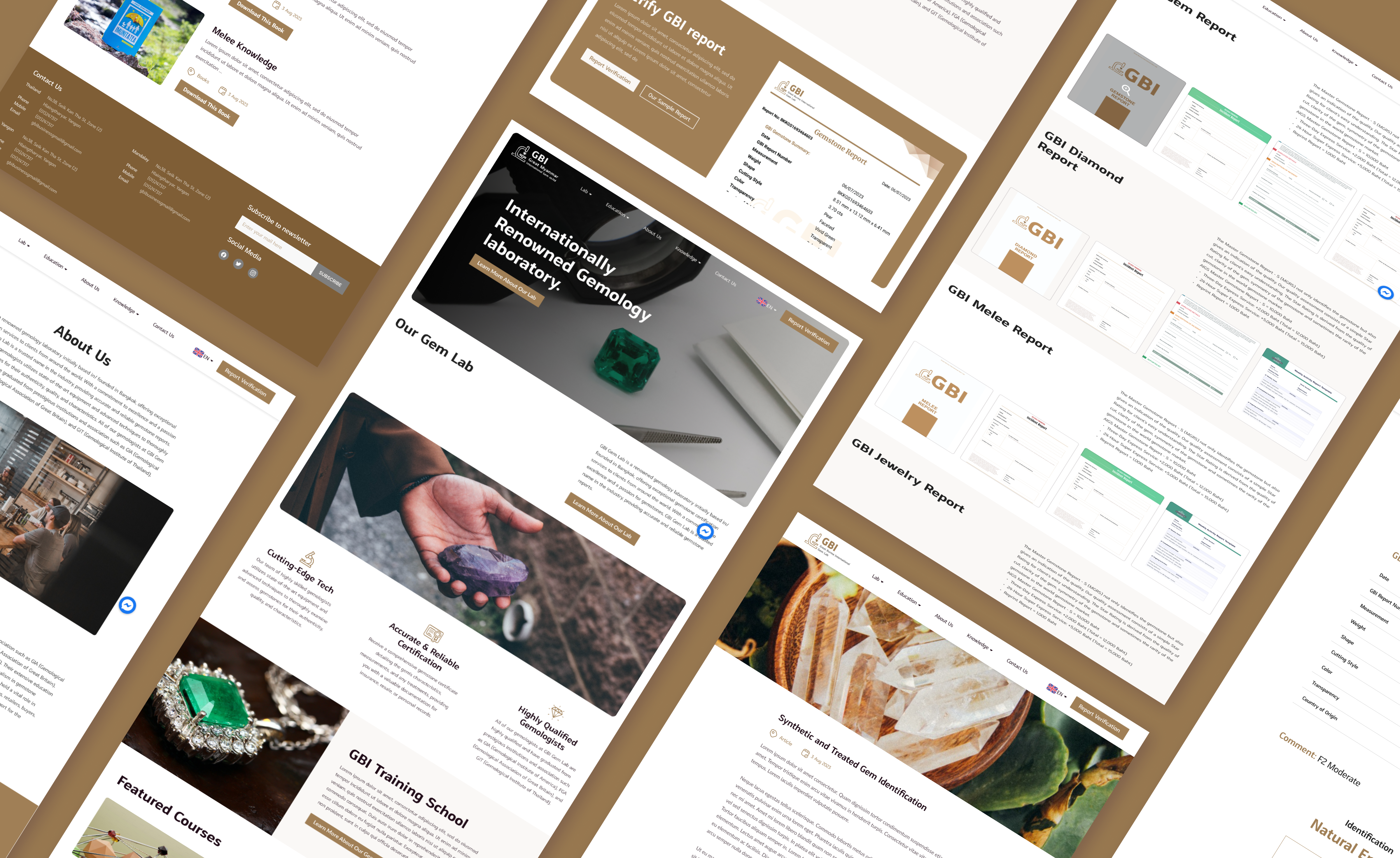
Full Site Structure
Organized around core services: certification, education, mobile verification, and gem education content
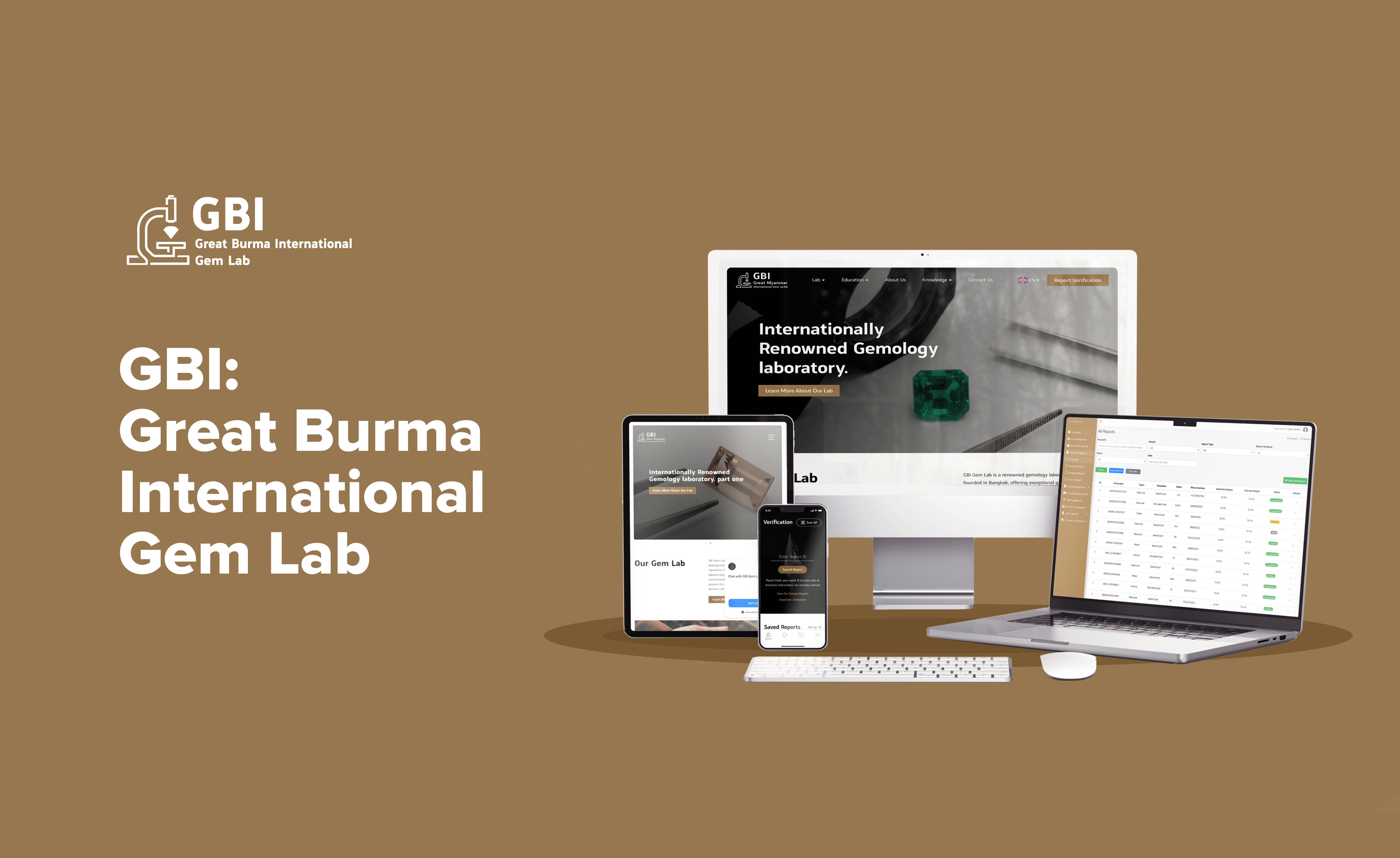
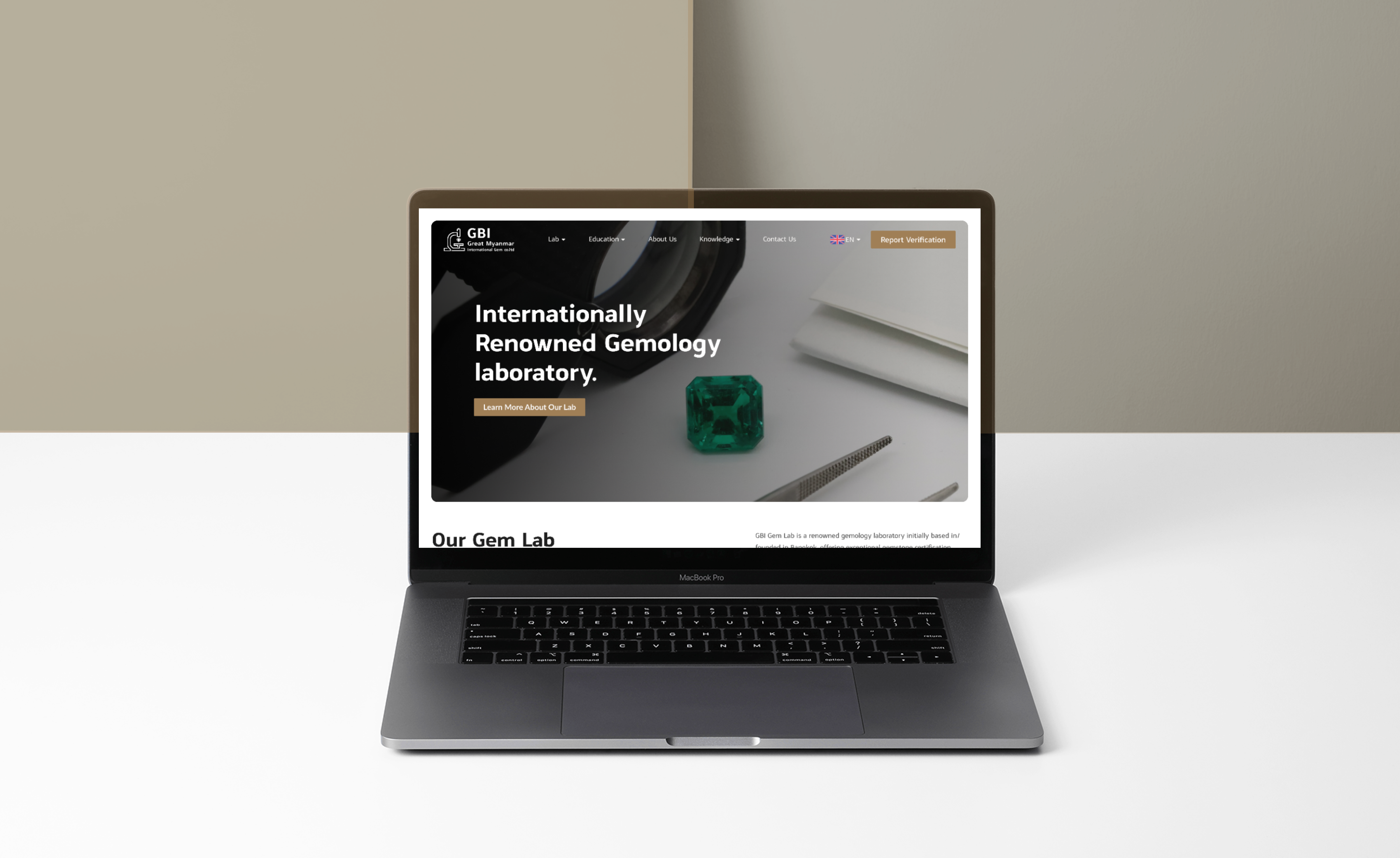
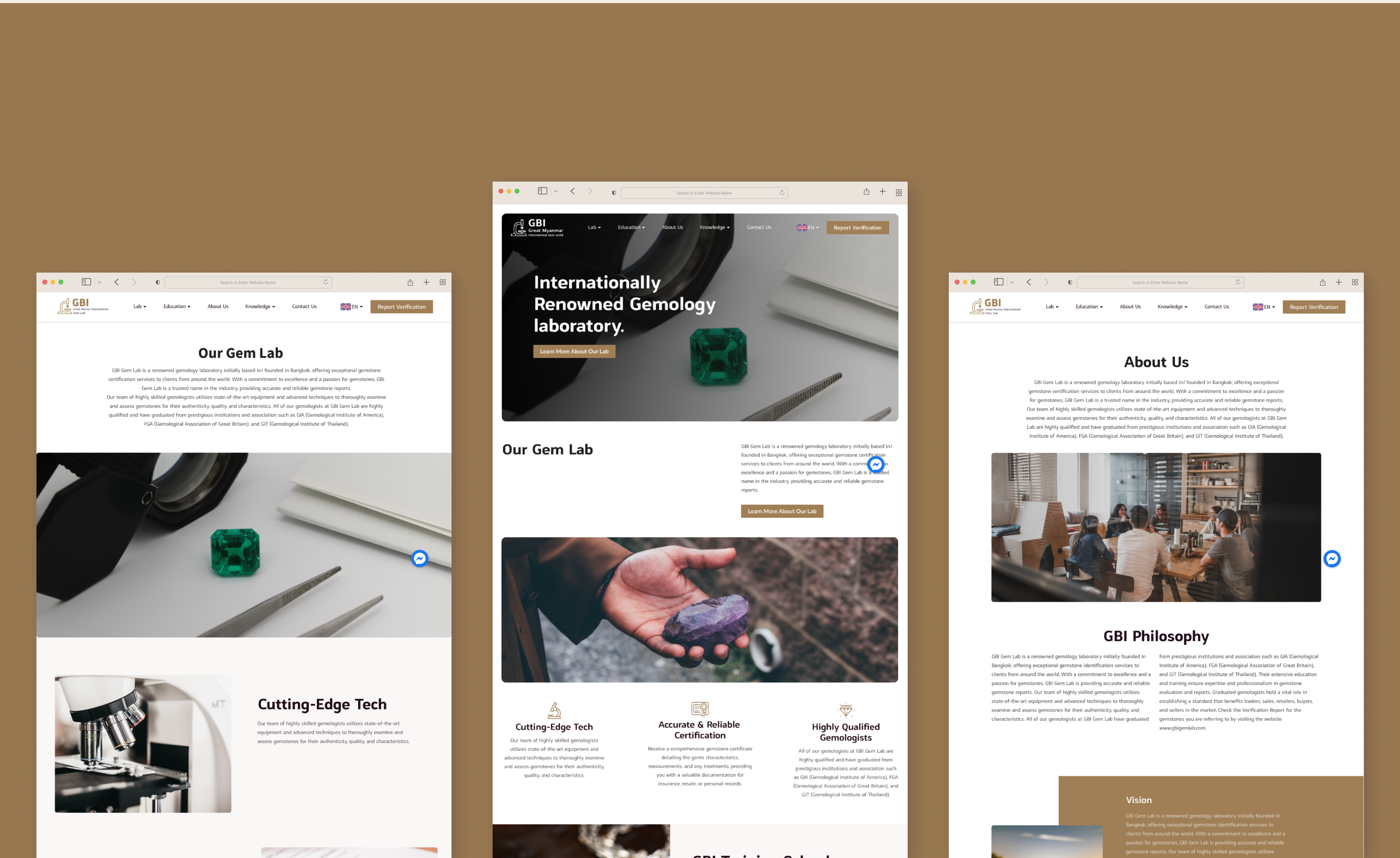
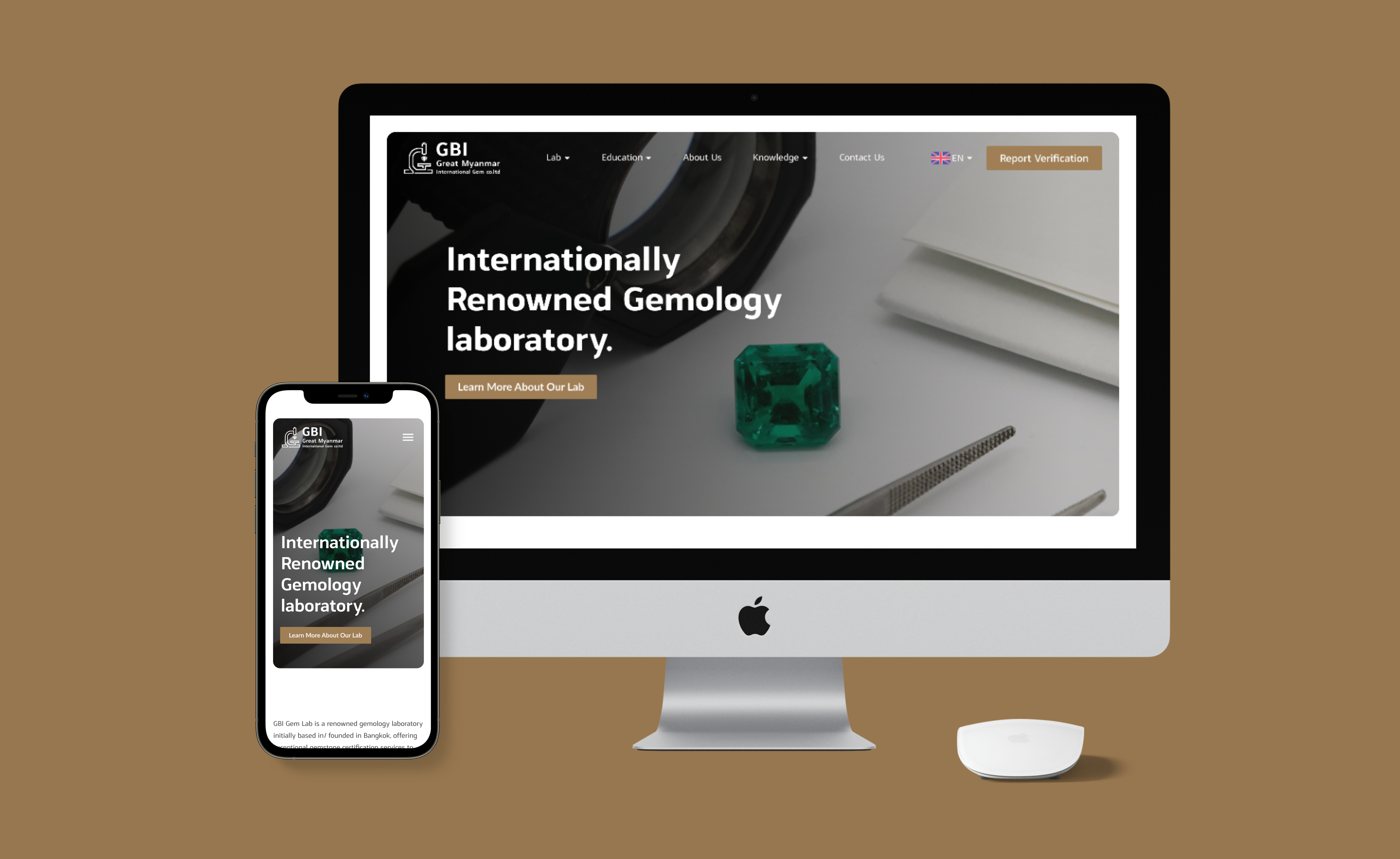
Website Interface & Features
Key screens showing the luxury gemological certification experience
Before vs. After
Measurable improvements in qualified inquiries and client confidence
Results & Key Takeaways
Impact metrics and lessons learned from balancing luxury with scientific credibility
Qualified inquiries increased within 6 months of launch
New clients cited website methodology clarity as decision factor
Average engagement time (vs 1m 30s industry standard)
Average rating with 50+ reviews praising professionalism
Lessons Learned
GBI Gem Lab — Gemological Authority
Complete website design + component system · Bangkok · 2023